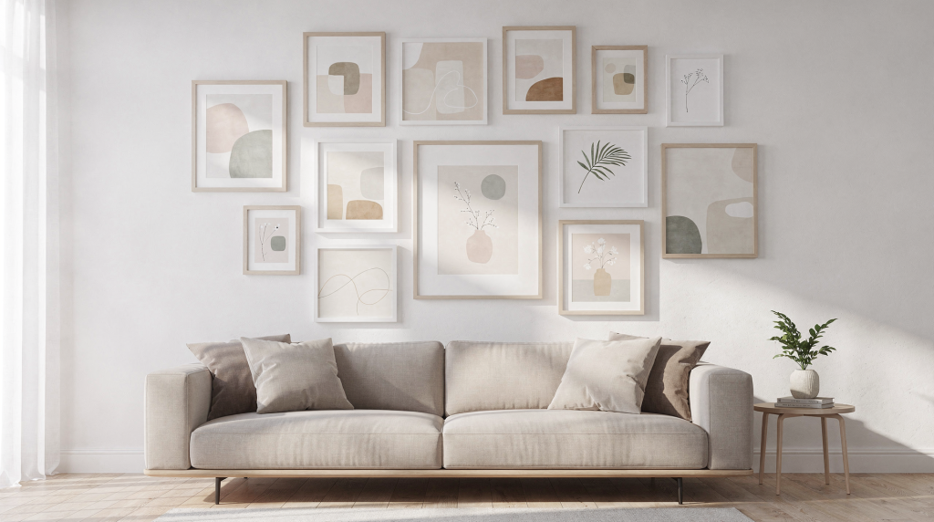
A gallery wall isn’t a random assortment of frames — it’s a single composition stretched across a wall. The real skill lies not in buying more prints, but in planning the layout, balancing scale, and hanging each piece with enough consistency that the whole arrangement reads as one deliberate statement. When it’s done right, the wall feels collected, personal, and effortlessly anchored to the room around it.
Why gallery walls work so well
Gallery walls solve two stubborn decorating problems at once. They fill those awkward blank expanses — the wall behind the sofa, the long hallway, the empty stretch above a console — and they let you bring together prints of different sizes, subjects, and frame styles without the room feeling chaotic. The secret is in the spacing, alignment, and visual weight. When those are under control, even a lively mix of botanical studies, abstract shapes, and black-and-white photography can read as calm and curated, not busy.
In a rental, where painting walls or mounting heavy shelving isn’t an option, a gallery wall becomes an especially powerful tool. It injects personality without permanent change. In a studio apartment, a well-edited cluster can define the living zone and draw the eye away from the bed or kitchenette. The best gallery walls feel as though they’ve grown over time, yet they follow a clear underlying structure. That tension — between collected and composed — is what makes the arrangement feel designed rather than accidental.
Start with the right wall
Not every blank wall deserves a gallery wall. The spot needs to be able to support the scale of multiple pieces without feeling cramped or swallowed. Look for natural gathering points:
- Above a sofa
- Over a console table
- Along a hallway
- Behind a dining bench
- Around a staircase landing
If the wall sits above furniture, the art must relate to the furniture’s size, not compete with it. A common mistake is hanging a tiny cluster over a long sofa, which makes the wall feel unfinished. As a rule of thumb, the overall width of the gallery should be roughly two-thirds to three-quarters the width of the piece below it. Leave about 6 to 8 inches between the top of the furniture and the bottom of the lowest frame — this keeps the grouping visually connected without crowding the surface. In a rental where you’re working with existing furniture, this distance also helps protect the wall from scuffs when you lean back or set down a drink.
Choose a layout before you hang anything
The biggest mistake is reaching for a hammer too soon. A strong gallery wall begins on the floor or with paper templates taped to the wall. This step lets you test proportion, rhythm, and breathing room before committing to holes — essential if you’re in a rented space where every nail matters.
Here are the most common layout types and where they shine:
| Layout type | Best for | Look and feel |
|---|---|---|
| Grid | Matching prints and frames | Clean, formal, structured |
| Centered cluster | Mixed prints with one anchor piece | Balanced and flexible |
| Linear row | Narrow walls and hallways | Calm and minimal |
| Salon style | Many sizes and frame styles | Collected and layered |
| Stair-step layout | Stairs and angled walls | Follows the architecture |
If you crave order, a grid is the easiest path — it works beautifully with a set of identically framed prints and can anchor a dining nook or home office. When you’re mixing sizes, a centered cluster or salon-style arrangement usually feels more natural because it lets the eye wander across the composition without hitting rigid lines. Salon-style, in particular, rewards the collector who has pieces in wildly different frames; the density and variety become the point. For a narrow hallway, a single linear row of prints hung at eye level can create a quiet gallery feel without overwhelming the passage.
The easiest way to plan the arrangement
This method has saved more walls — and more relationships with landlords — than I can count. It’s low-risk and high-reward:
- Measure the wall space you want to fill.
- Measure the furniture below it, if any.
- Lay your prints out on the floor in roughly the same proportions as the wall.
- Move them around until the spacing feels even and the visual weight is balanced.
- Trace each frame onto kraft paper or butcher paper and cut out the templates.
- Tape the paper shapes to the wall with painter’s tape.
- Adjust until the overall composition feels right — step back often.
- Mark hanging points only after the layout is final.
This process forces you to confront scale before you make a single hole. You’ll spot problems early: an oversized print dominating the group, two similar-sized frames butting up against each other, or a gap that looks fine on the floor but awkward on the vertical plane. For renters, paper templates are a gift — they let you live with the arrangement for a day or two, see how the light hits it, and tweak without consequence.
How far apart should art prints be?
For most gallery walls, a gap of 2 to 3 inches between frames is the safest starting point. This distance creates a sense of unity without making the prints feel crowded. Smaller frames can sit a little closer, while larger frames need more breathing room to keep their individual presence.
| Frame size | Suggested gap |
|---|---|
| Small frames (up to 8×10″) | 1.5 to 2 inches |
| Medium frames (11×14″ to 16×20″) | 2 to 3 inches |
| Large frames (18×24″ and above) | 3 to 4 inches |
Consistency is what makes mixed art feel intentional. When the spacing wavers — 2 inches here, 4 inches there — the wall starts to look haphazard, no matter how beautiful the individual prints are. In a compact room, a tighter 2-inch gap can help the arrangement read as one cohesive block, which is especially useful if you’re trying to create a focal point without eating up visual square footage. In a more expansive space, a generous 3-inch gap gives each piece room to breathe and keeps the wall from feeling heavy.
Pick an anchor piece first
If your gallery wall includes one print that naturally draws the eye — maybe it’s larger, bolder in color, or carries the strongest subject — start with that piece. This anchor becomes the gravitational center of the composition. It might be:
- The largest print
- The most colorful print
- The print with the strongest subject or emotional weight
- The one you want to sit at eye level
Place the anchor first, then build outward with supporting pieces. This approach makes the wall far easier to balance, especially when frames vary in size and finish. Think of it like arranging furniture in a living room: you position the sofa first, then add chairs and tables around it. The anchor gives the eye a place to land, and the surrounding prints create rhythm. In a bedroom, for instance, a large, soft-toned landscape above the bed can anchor a collection of smaller botanical sketches, with the whole arrangement echoing the linen bedding and a textured throw.
How high should a gallery wall hang?
A reliable standard is to center the whole arrangement around 57 to 60 inches from the floor — that’s roughly average eye level. This doesn’t mean every frame must sit at that exact height; it means the visual center of the composition should land there. If the wall is above furniture, use the furniture as your lower reference point and keep the full grouping comfortably above it, typically with that 6-to-8-inch gap. The goal is to connect the artwork to the room, not let it float too high and feel disconnected from the life below it.
In rooms with high ceilings, you can nudge the center up an inch or two, but resist the urge to fill the vertical space above — negative space is part of the composition. In a rental with lower ceilings, sticking closer to the 57-inch mark and anchoring the arrangement to the furniture keeps the room feeling grounded rather than squashed.
Frame choice: match first, mix second
You don’t need identical frames, but you do need visual order. A mixed-frame gallery wall works best when there’s still a unifying thread running through it. That thread could be:
- Same color family (all warm woods, all matte black)
- Same frame finish (brushed brass, unlacquered oak)
- Similar mat widths (consistent borders calm the eye)
- Repeated print tone (a palette of muted earth tones, for example)
- Consistent subject matter (all landscapes, all abstract forms)
If you’re mixing black, wood, and metallic frames, repeat each finish at least twice so the result looks deliberate. A single isolated gold frame in a sea of black reads as an accident; two or three gold frames scattered through the arrangement become a motif. This principle holds whether you’re hanging art in a formal living room or a casual breakfast nook. I often suggest pulling one frame finish from an existing element in the room — a wooden chair leg, a brass lamp, the dark metal of a curtain rod — to tie the wall into the larger space.
Easy frame pairings that usually work
- Black frames + black-and-white prints — high contrast, graphic, and timeless. Perfect for a modern apartment or a gallery wall in a home office.
- Natural wood frames + warm-toned art prints — the wood’s warmth amplifies ochre, terracotta, and olive tones. This pairing feels especially at home in spaces with linen curtains or jute rugs.
- Thin white frames + airy, minimal artwork — the frames nearly disappear, letting delicate line drawings or pale watercolors breathe. Ideal for a small room where you want art without visual weight.
- One metallic accent frame used sparingly in a larger wall — a single brass or silver frame among muted companions catches the light and adds a subtle layer of polish. Use it around a print you want to highlight.
A step-by-step hanging method
Once the paper templates are approved and the layout is final, hang in this order:
- Start with the anchor piece — it sets the tone.
- Use a level to make sure it sits perfectly straight; even a slight tilt will throw off the entire grid.
- Hang the next closest pieces around it, working outward.
- Keep checking spacing with a tape measure as you go.
- Step back every two or three frames to assess the overall balance.
- Adjust early rather than after the whole wall is complete — it’s much easier to shift one frame than to rehang five.
If the wall is large, work from the center outward. This keeps the composition balanced and reduces the chance of one side drifting too wide or too high. For renters using adhesive strips, follow the weight limits carefully and press each strip firmly for the recommended time. In older homes with plaster walls, picture hooks with angled nails often hold more securely than adhesive options, but always test a small hidden area first.
Tools that make the job easier
You don’t need a professional kit, but a few basics will save time and frustration:
- Tape measure
- Painter’s tape (low-tack, won’t peel paint)
- Pencil
- Level (a small torpedo level is handy)
- Kraft paper or butcher paper for templates
- Picture hooks or nails appropriate for your wall type
- Hammer
- Adhesive strips for lightweight prints (check weight ratings)
Paper templates are the unsung heroes of this process. They let you test placement without commitment, and they’re especially useful when you’re working around light switches, thermostats, or architectural quirks. For very light pieces — small frames under 5 pounds — adhesive hanging strips can be a renter’s best friend, eliminating nail holes entirely. Just be sure to clean the wall surface first and press firmly.
Common mistakes to avoid
- Hanging too high — the most frequent error. When the bottom row floats a foot above the sofa, the wall feels disconnected.
- Spacing frames unevenly — even a half-inch variation becomes obvious once the wall is complete.
- Choosing too many unrelated frame styles — without a unifying element, the wall looks like a jumble sale.
- Starting without a plan — a nail in the wrong place means patching and repainting, or losing your deposit.
- Making the gallery wall too small for the wall — a tiny cluster on a vast blank expanse reads as timid, not curated.
- Using prints that are all the same size with no variation — unless you’re deliberately building a grid, identical sizes can feel static.
- Forgetting to relate the arrangement to nearby furniture — the art should feel like it belongs to the sofa, console, or bench below it.
Scale is the silent saboteur. A gallery wall that’s too small for its wall looks like an afterthought; one that’s too large cramps the room. Before you commit, stand back and ask: does this grouping hold the wall, or does the wall swallow it? In a living room, the arrangement should feel like a natural extension of the seating area, not a separate floating island.
If you want the wall to feel more polished
These finishing touches turn a good gallery wall into a great one:
- Repeat one color from the art in a nearby cushion, throw, or rug. A deep blue in a print echoed in a velvet pillow on the sofa instantly ties the room together.
- Keep mat widths consistent where possible. A uniform 2-inch mat around most pieces creates a quiet rhythm, even if frame styles vary.
- Leave a little negative space around the outer edges of the grouping — don’t push frames right to the corners of the wall. This breathing room lets the composition feel intentional rather than squeezed in.
- Mix horizontal and vertical pieces carefully. A single horizontal print in a column of verticals can act as a visual pause, but too many orientation changes can feel chaotic.
- Limit the palette if the room is already busy. In a space with patterned wallpaper or bold textiles, a gallery wall of black-and-white prints in simple frames can provide a calming counterpoint.
A gallery wall doesn’t need to shout to be effective. In many rooms, the most successful version is the one that feels collected, balanced, and easy to live with — the kind of wall that makes you pause for a moment, then settle back into the sofa with a cup of tea.
Quick checklist before you hang
- Measured the wall and the furniture below it
- Chosen a clear layout style that suits the space
- Picked an anchor piece to build around
- Planned the spacing and kept it consistent
- Tested the arrangement on the floor or with paper templates
- Marked hanging points only after the layout was final
- Checked alignment with a level at every step
- Stepped back to review the full composition before the last nail
FAQ
How many prints should be in a gallery wall?
There’s no magic number. A small wall — say, a narrow powder room or a compact entryway — might need only 3 to 5 prints to feel complete. A larger wall above a sofa or along a hallway could easily hold 7 to 12 or more. The right count depends on wall size, frame scale, and how dense you want the composition to feel. Start with fewer pieces and add over time; a gallery wall that grows with you often feels more authentic than one bought all at once.
Can I mix different frame colors?
Absolutely. The key is to repeat each frame finish at least twice so the mix reads as intentional. If you have one black frame, one wood, and one brass, scatter two of each through the arrangement. Keep the overall palette controlled — three finishes are usually plenty. This approach works especially well in eclectic interiors where furniture and textiles already mix materials.
Should all the prints be the same size?
No. Matching sizes create a crisp grid look, which is perfect for a formal dining room or a modern hallway. But mixed sizes often feel more relaxed and interesting, especially in living spaces where you want the wall to feel lived-in. The trick is to control spacing and balance the visual weight so that no single piece overpowers the rest unless it’s the anchor.
How do I know if my gallery wall is too high?
If the grouping feels disconnected from the furniture below it, or if you have to tilt your head up to see the center, it’s probably too high. The visual center of the composition should land around 57 to 60 inches from the floor. When in doubt, err on the lower side — art that relates to the furniture and the people in the room always feels more welcoming.
What is the best spacing for a small gallery wall?
Start with 2 inches between frames. If the wall is very compact or the frames are tiny — think a collection of 5×7″ prints in a narrow nook — you can go down to 1.5 inches, but keep the spacing consistent across the whole arrangement. Tight, even spacing helps a small grouping read as one cohesive unit rather than a scattered handful.
Final thought
The best gallery walls are built like good rooms: with proportion, repetition, and enough restraint to let the art breathe. Plan the layout first, keep the spacing consistent, and hang with the room’s scale in mind. That’s what turns a collection of prints into a composition that feels finished, personal, and deeply at home.