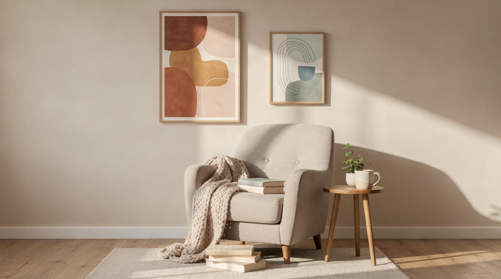
Why art matters in a reading nook
A reading nook is, by definition, a low-stimulation zone. The chair, the lamp, the stack of books — they’re all there to support a single quiet activity. The art on the wall should do the same. It needs to settle into the background of your attention, not demand centre stage. That’s why soft palettes, quiet compositions, and familiar subjects tend to work so reliably here: they create visual rest rather than visual noise.
Watercolours, Scandi-inspired pieces, botanical prints, and architectural scenes are the go-to choices for spaces meant for unwinding — and for good reason. They carry a natural stillness. Geometric or typography-heavy prints, by contrast, can feel more energetic, almost restless, which is rarely what you want when you’re trying to sink into a novel. The art should feel like a exhale, not an inhale.
The best pairing also depends on how and when you use the nook:
- If the nook is for evening reading, choose softer, warmer art — think muted ochres, dusty blues, or prints with a gentle tonal range that won’t feel harsh under lamplight.
- If the nook sits in a bright corner with plenty of daylight, you can handle more contrast and detail without the space feeling busy.
- If the nook is part of a larger living room, the print should connect to the room’s existing palette. It doesn’t need to match, but it should feel like it belongs to the same conversation.
What makes a good art print pairing
A strong pairing isn’t about finding a “pretty” print and calling it done. It’s about creating a relationship between the artwork and everything else in the corner — the textiles, the furniture finish, the quality of light. When that relationship works, the nook feels intentional rather than decorated.
Here’s what to look for:
- Shared color temperature — warm with warm, cool with cool, or a deliberate, controlled contrast
- Similar mood or subject matter that reinforces the atmosphere you’re building
- Proper scale for the wall and the furniture beneath it
- Frames that support the style of the room rather than introducing a new visual language
- Enough visual calm to avoid distraction — the print should never compete with the book in your hands
In practice, this usually means choosing art that echoes one or two colors already present in the nook: the upholstery, a throw blanket, a rug, or even the lampshade. You can also use art to introduce a single accent color that repeats elsewhere in the room — a terracotta print that picks up the tone of a ceramic vase on the side table, for instance. The key is that nothing feels random.
Best art print pairings by style
1. Soft botanicals with linen and wood
This is one of the easiest, most forgiving pairings for a cozy nook — and it’s the one I return to most often. Botanical prints feel calm and organic by nature, especially when they’re surrounded by natural materials like oak, linen, wool, and rattan. The artwork reinforces the textures already in the room, so the whole corner reads as a cohesive, tactile space rather than a collection of separate objects.
The subject matter itself is restful: leaves, stems, soft florals rendered in watercolour or delicate line work. The palette usually stays gentle and timeless — sage greens, warm creams, faded terracottas — which means the print won’t date and won’t fight with seasonal changes in your textiles.
Best for:
- Scandinavian interiors
- Cottage-inspired corners
- Neutral reading spaces
Why it works:
- The artwork reinforces the natural textures in the room.
- The subject matter feels restful.
- The palette usually stays gentle and timeless.
Try this if your nook includes a linen armchair, a wood side table, or a neutral or sage-toned throw. The botanical print will feel like it’s always belonged there.
2. Architectural sketches with classic furnishings
Architectural line drawings or monochrome city scenes bring structure to a reading nook without making it feel busy. There’s a quiet precision to them that works especially well in spaces with traditional furniture or a more tailored look — think apartments with older details, elegant bookish corners, or rooms with moldings and paneling.
The clean lines pair naturally with formal furniture shapes, and the art adds interest without softness turning into blur. It feels collected rather than decorative for decoration’s sake, which is a quality I always look for in a reading corner. You want the space to feel like it evolved over time, not like it was styled in an afternoon.
Best for:
- Apartments with older details
- Elegant, bookish corners
- Rooms with moldings or paneling
Why it works:
- Clean lines pair well with formal furniture shapes.
- The art adds interest without softness turning into blur.
- It feels collected rather than decorative for decoration’s sake.
3. Warm landscape prints with layered textiles
Landscape prints can make a nook feel quietly expansive — a real gift if the space is small or tucked into an alcove. Look for softened horizons, muted skies, fields, coastlines, or wooded scenes rather than dramatic high-contrast images. The goal is atmosphere, not drama.
What I love about this pairing is how the scene creates an emotional escape. When you’re curled up with a book, a gentle landscape on the wall can feel like a window onto somewhere else. Warm tones in the print — ochres, dusty pinks, soft greens — balance beautifully with lamps, knit throws, and upholstered seating. The artwork adds depth without visual noise, which is exactly what a small nook needs.
Best for:
- Small alcoves
- Window-side reading corners
- Spaces that need a sense of calm depth
Why it works:
- The scene creates an emotional escape.
- Warm tones balance lamps, knit throws, and upholstered seating.
- The artwork adds atmosphere without visual noise.
4. Vintage-style still lifes with deeper color schemes
If your nook leans moody — darker walls, velvet or leather seating, antique or vintage pieces — a still life print can be a great fit. Think books, flowers, fruit, ceramics, or tabletop scenes rendered in richer, more saturated colors. The subject matter feels inherently appropriate for a literary corner; there’s something about a painted stack of books or a quiet vase of flowers that speaks the same language as a reading habit.
Deeper tones make the nook feel intentional and cocooning rather than dim. The print can bridge the gap between decor and art, blurring the line so the whole corner feels like a single, composed moment. It’s a more layered look, but when it works, it’s deeply satisfying.
Best for:
- Darker walls
- Velvet or leather seating
- Reading nooks with antique or vintage pieces
Why it works:
- The subject feels appropriate for a literary corner.
- Deeper tones make the nook feel intentional and cocooning.
- It can bridge the gap between decor and art.
5. Abstract color fields with modern minimalism
If your space is pared back, a restrained abstract print can add emotion without clutter. The trick is to choose soft shapes, blurred edges, or limited palettes instead of loud, high-contrast designs. You’re not looking for a statement piece; you’re looking for something that breathes.
This pairing keeps the space feeling edited and calm. The print adds softness to minimal furniture — a counterbalance to clean lines and neutral upholstery — and prevents the nook from looking too stark or unfinished. In a contemporary apartment with strong furniture silhouettes, a gentle abstract can be the element that makes the corner feel lived-in rather than showroom-ready.
Best for:
- Minimal interiors
- Contemporary apartments
- Nooks with strong furniture silhouettes
Why it works:
- It keeps the space feeling edited.
- The print adds softness to minimal furniture.
- It prevents the nook from looking too stark.
How to choose the right print for your nook
Step 1: Read the room first
Before you even open a browser tab, take stock of what the nook already has. I always start with a quick audit: the main furniture finish, the dominant wall color, the textile colors, the amount and quality of light, and the style of nearby rooms. If the nook is already rich in pattern or texture — a busy rug, a patterned armchair — keep the art simpler. If the space is very plain, the print can do more visual work and carry a bit more personality.
Step 2: Decide whether the print should blend or contrast
There are two safe approaches here. You can blend — choose a print that sits within the same palette as the room, so it feels like a natural extension of the space. Or you can contrast — choose one strong accent color that repeats elsewhere, like a deep blue print that echoes the piping on a cushion. For a reading nook, blending is usually the safer, more restful option. Contrast can work beautifully, but only if the print feels deliberate and not loud. The moment it starts to shout, the nook stops feeling cozy.
Step 3: Match the scale to the wall
A common mistake — and one I see constantly — is choosing art that is too small for the wall. In a nook, undersized art can make the wall look accidental, like an afterthought. The print should occupy a meaningful visual share of the wall, not float in a sea of empty space.
Here’s a simple sizing guide to work from:
| Nook type | Good print scale | Notes |
|---|---|---|
| Small corner nook | One medium print | Keeps the space calm and uncluttered |
| Chair with narrow wall | Vertical print | Works well in tight spaces |
| Bench or armchair wall | One large print or a pair | Creates a stronger focal point |
| Built-in nook | Small gallery arrangement | Good when wall width is limited |
A useful rule for artwork above furniture is to aim for a width that feels proportionate to the piece below it. In reading nooks, that usually means letting the art occupy a meaningful visual share of the wall, not just a token gap. If the chair is wide, a single small print will look lost; if the chair is narrow, an oversized piece can overwhelm.
Step 4: Pick a frame that fits the mood
The frame is part of the pairing — it can soften or sharpen the whole look. I think of frames as the handshake between the art and the room. Natural wood frames warm up neutral prints and feel approachable. Black frames sharpen botanical, architectural, or monochrome art, giving them a crisp, classic edge. Light oak frames feel relaxed and informal — perfect for a casual reading corner. Thin metal frames suit contemporary spaces and tend to disappear visually, which is useful if you want the artwork itself to stay subtle. White frames can also recede, but they work best when the walls are light and you want the print to feel almost weightless.
Frame and print combinations that work well
| Print style | Best frame | Effect |
|---|---|---|
| Botanical illustration | Light wood | Soft, natural, relaxed |
| Architectural sketch | Black | Crisp, classic, structured |
| Landscape | Oak or walnut | Warm and grounded |
| Still life | Dark wood | Rich and traditional |
| Abstract | Thin metal or simple wood | Clean and modern |
Placement tips that make a big difference
A beautiful print can still feel wrong if it’s hung badly. In a reading nook, placement should support seated viewing — the art needs to feel connected to the person in the chair, not to someone standing across the room.
Keep it at seated eye level when possible. This is especially useful if the nook is designed around an armchair. When you’re sitting down with a book, the art should sit comfortably in your peripheral vision, not float high above you.
Avoid hanging too high. If the print sits too far above the chair, the nook loses intimacy. A lower placement usually makes the corner feel more enclosed and welcoming — like a room within a room.
Use one piece when the space is small. A single print is often stronger than a crowded wall in a compact nook. If you do want a gallery feel, keep the arrangement small and controlled — two or three pieces at most, with consistent framing.
Test the placement first. A simple mock-up helps avoid mistakes. Cut paper to the size of the frame, tape it to the wall, sit in the chair, and check the view. Adjust until the print feels balanced from where you’ll actually be sitting. It’s a small step that saves you from living with a misjudged nail hole.
Common mistakes to avoid
- Choosing art that is too energetic for a quiet space
- Ignoring the room’s existing palette
- Using a tiny print on a large wall
- Mixing too many styles in one corner
- Picking a frame that clashes with the furniture
- Hanging the art too high for seated viewing
- Treating the nook like a gallery wall when it needs calm
A practical checklist before you buy
- Does the print support the mood of the nook?
- Does it repeat at least one color already in the room?
- Is the scale appropriate for the wall?
- Does the frame suit the furniture and finishes?
- Will the artwork still feel right beside books, lighting, and textiles?
- Does it look calm from the chair, not just from across the room?
Best pairings by reading nook mood
| Desired mood | Print direction | Good supporting pieces |
|---|---|---|
| Calm and airy | Botanicals, soft abstracts | Linen throw, oak table, pale lamp |
| Bookish and classic | Architectural sketches, still lifes | Leather chair, brass lamp, dark frame |
| Warm and cocooning | Landscapes, muted color studies | Wool blanket, textured cushions, walnut frame |
| Modern and clean | Minimal abstracts, monochrome prints | Simple shelving, neutral upholstery, slim frame |
Final thoughts
The best art print pairings for a cozy reading nook are the ones that help the space feel settled. Start with the room’s mood — what do you want to feel when you sit down? — then choose artwork that either gently blends in or gives the nook one intentional accent. Keep the scale sensible, the palette controlled, and the frame in dialogue with the furniture. When in doubt, choose quieter art over louder art. A reading nook should feel like a place you want to stay in, not a corner that demands attention.
FAQ
What kind of art is best for a reading nook?
Soft botanicals, landscapes, architectural sketches, still lifes, and restrained abstracts usually work best because they create a calm visual atmosphere that supports the quiet rhythm of reading.
Should the art match the room exactly?
No. It should connect to the room, but not disappear into it. Matching one or two key colors is often enough to create a sense of cohesion without the print feeling redundant.
Is one large print better than a gallery wall?
In a small reading nook, yes. One larger print often feels calmer and more intentional. A small, edited gallery can work if the space allows it, but restraint is key.
What frame color is most versatile?
Light wood, black, and simple oak are the easiest choices because they work across many styles and don’t demand attention.
Where should I hang art in a reading nook?
Usually at seated eye level or slightly above the chair, so it feels visually connected to the place where you sit and read rather than floating disconnected on the wall.