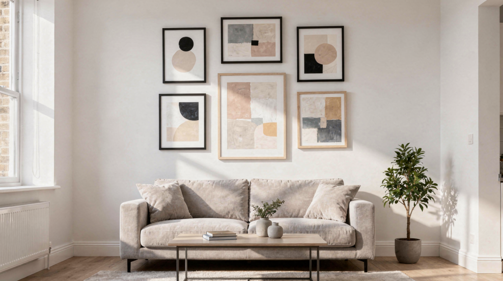
Small apartments can feel instantly more intentional when the wall art is chosen with care. The right piece can make a room feel taller, calmer, and more finished; the wrong one can make it feel cluttered or undersized. I’ve walked into too many compact living rooms where a single well-scaled canvas above the sofa pulled the whole space together, while a scattering of tiny frames did the opposite — it fragmented the wall and made the room feel restless. The difference comes down to a few deliberate choices.
Why wall art matters more in a small apartment
In a compact home, every visual decision carries more weight. There’s no generous square footage to absorb a mistake. Art is not just decoration here — it helps define scale, create a focal point, and give a room personality without taking up floor space. A thoughtfully placed piece can anchor a seating area, draw the eye upward, or make an awkward wall feel purposeful rather than leftover.
The goal is not to fill every wall. It is to choose art that fits the room’s proportions, supports the layout, and adds depth without crowding the space. In practice, that often means leaving some walls bare so the room can breathe.
Start with the room, not the artwork
Before buying anything, look at how the apartment functions. I usually recommend walking through the space at different times of day and noticing where your gaze naturally settles. That’s often where art will have the most impact.
Ask yourself:
- Where do I spend the most time?
- Which wall is most visible when I enter?
- Where does the furniture already create a natural focal point?
- Which walls feel empty rather than just open?
In a small apartment, the best wall art usually goes where the eye naturally lands first:
- above the sofa
- above the bed
- behind a desk
- in the entryway
- along a narrow hallway
- over a sideboard or console
If a wall is visible but awkwardly shaped — perhaps a sliver beside a window or a narrow stretch between doorways — art can make it feel intentional instead of leftover. A vertical piece or a small curated grouping often turns that tricky spot into a feature.
The simplest rule for sizing wall art
A reliable starting point is to size art in relation to the furniture beneath it. A common rule is to choose artwork that is about two-thirds to three-quarters the width of the furniture below it. That proportion keeps the piece from looking too small or overwhelming the surface. When I’m styling a sofa wall, I’ll often tape out a few size options first — it’s remarkable how a print that looks substantial in a catalog can feel lost above a wide sofa.
For a blank wall, aim to fill roughly 50% to 75% of the available width, depending on the room and the arrangement. The exact number depends on ceiling height and how much breathing room you want around the piece, but this range prevents the art from feeling disconnected from the rest of the room.
Quick sizing guide
| Placement | Good visual target | What it does |
|---|---|---|
| Above sofa | 60%–75% of sofa width | Grounds the seating area |
| Above bed | 60%–75% of bed width | Balances the headboard and wall height |
| Above desk | Roughly 2/3 desk width | Creates a focused work zone |
| Solo wall | 50%–75% of wall width | Prevents the piece from feeling lost |
| Narrow wall | Vertical format or stacked pieces | Uses height instead of width |
A common mistake in small apartments is choosing art that is too tiny because the room is small. Small rooms still need visual weight. A piece that is slightly larger than expected often looks better than one that disappears. I’ve seen a single oversized print transform a cramped studio into a space that felt curated and calm, simply because it gave the eye one confident place to land.
Height matters as much as size
Most art should be hung with the center around eye level. A practical reference point is about 57 to 60 inches from the floor. That keeps the piece feeling natural instead of floating too high — a mistake I see constantly, especially in rentals where previous tenants left nails in odd places.
When hanging art above furniture:
- leave a small gap between the furniture and the frame — typically 6 to 10 inches, so the two feel related but not cramped
- avoid pushing the art too close to the ceiling
- keep the center aligned across a grouping
If the art is hung too high, the room starts to feel disjointed, as if the wall and the furniture belong to different rooms. If it sits too low, it can make the ceiling feel lower than it is and the furniture feel top-heavy.
Best art formats for small apartments
Not every format works equally well in compact rooms. The best choice depends on the wall shape and the mood you want. Over the years, I’ve found that most small-apartment walls fall into one of four format solutions.
1. One larger statement piece
A single large print can work beautifully in a small apartment because it creates calm. Instead of breaking the wall into many parts, it gives the room one strong focal point. This is my go-to recommendation for renters who want a clean, polished look without drilling multiple holes.
Best for:
- above a sofa
- above a bed
- living rooms with minimal furniture
- renters who want a clean look
Why it works:
- makes the space feel deliberate
- reduces visual clutter
- often looks more expensive and polished
2. A pair of matching prints
Two coordinated pieces work well on narrow walls or over longer furniture. They create rhythm without feeling busy. I often use this format in bedrooms with symmetrical nightstands or in entryways where a single large piece would feel too heavy.
Best for:
- bedroom walls
- entry consoles
- dining nooks
- symmetrical layouts
3. A small gallery wall
A gallery wall can be effective in a small apartment if it is edited carefully. The key is restraint. Keep the palette cohesive and use similar frame finishes. I’ve learned that the most successful small-space gallery walls are the ones where someone stopped before adding that one extra piece.
Best for:
- walls with awkward proportions
- stair landings
- blank walls that need personality
- renters who want a collected look
Good gallery walls usually include:
- 3 to 5 pieces
- one unifying color or theme
- consistent spacing — typically 2 to 3 inches between frames
- some breathing room around the edges
4. Vertical compositions
If your apartment has low ceilings or narrow walls, vertical art can draw the eye upward and make the room feel taller. This is one of the oldest tricks in a stylist’s playbook, and it works especially well in hallways or beside tall furniture.
Best for:
- hallways
- beside windows
- beside bookshelves
- beside a tall plant or floor lamp
How to choose art that makes a small room feel bigger
Some visual tricks work especially well in compact spaces. These aren’t illusions — they’re about how the eye moves across a room and how weight is distributed on a wall.
Use lighter visual weight
Art with airy composition, soft margins, or lighter backgrounds tends to feel less heavy on the wall. A watercolor with generous white space, a photograph with a soft focus, or a line drawing with plenty of breathing room won’t press into the room the way a dark, densely composed oil painting might.
Think vertically when the room feels low
Tall compositions, stacked prints, or vertically oriented photography can help the eye move upward. In a room with eight-foot ceilings, a vertical piece hung above a low console can add a surprising sense of height.
Repeat one color from the room
Art does not need to match the sofa or rug exactly. It just needs one or two colors that connect it to the rest of the space. That subtle thread — a terra-cotta tone that echoes a throw pillow, a blue that picks up the undertone in a rug — makes the room feel cohesive without being matchy.
Use frames intentionally
Framing changes how a piece reads:
- thin black frames feel crisp and modern
- light wood feels warm and casual
- white frames feel soft and understated
- no frame or canvas can feel lighter and less formal
In a small apartment, heavy frames can make a wall feel denser. Lighter framing usually works better unless you want a strong graphic look. I tend to reserve chunky, ornate frames for larger rooms where they have space to breathe.
What to avoid in a small apartment
A lot of bad wall art choices come from one of three mistakes: wrong scale, too many competing pieces, or poor placement. These are the patterns I see repeated in homes that feel unsettled rather than styled.
Avoid these common issues:
- buying art before measuring the wall
- hanging pieces too high
- using too many small prints with no clear structure
- mixing frame styles without intention
- choosing art that is visually louder than the room itself
- filling every wall just because it is available
Not every wall needs art. In small spaces, blank wall area gives the room room to breathe. A single empty wall can act as a visual pause, making the furnished areas feel more intentional.
A practical step-by-step process
Use this simple approach if you want to choose wall art without guessing. I’ve used variations of this sequence on countless projects, and it removes most of the uncertainty.
Step 1: Measure the wall and furniture
Write down:
- wall width
- wall height
- furniture width below the art
- viewing distance from the main seating area
Step 2: Decide the role of the art
Choose one primary goal:
- create a focal point
- make the room feel taller
- add warmth
- cover an awkward wall
- tie the color palette together
Step 3: Pick the format
Choose between:
- one large print
- two medium prints
- a small gallery
- vertical stacking
Step 4: Test the size before buying
Tape paper cutouts to the wall or lay the pieces out on the floor first. This helps you see the scale in context, not just in isolation. I keep a roll of kraft paper in my kit for exactly this purpose — it’s the cheapest way to avoid an expensive mistake.
Step 5: Check the balance with furniture
The art should feel related to the furniture, not detached from it. If the sofa is wide, the art should not look like an afterthought. Stand back and ask whether the two feel like they belong in the same room.
Step 6: Hang at the right height
Use the center-height rule and keep spacing consistent. If you’re hanging a pair or a grid, measure twice before putting holes in the wall.
Room-by-room guidance
Living room
Choose one strong piece or a clean pair above the sofa. This is usually the easiest place to create impact without overcrowding. The living room is where you’ll spend the most waking hours, so the art here should feel like a natural part of the seating area, not a distraction.
Best approach:
- one large print
- two coordinating pieces
- a restrained gallery wall above a console
Bedroom
Keep the mood calm. Soft color palettes, abstract work, landscape prints, or black-and-white photography usually work well. The bedroom is a place for the eye to rest, so avoid anything too busy or high-contrast directly above the bed.
Best approach:
- art centered above the bed
- vertical pieces beside the bed
- matching pair over a headboard
Entryway
The entry should feel welcoming, not crowded. Use art that is easy to read quickly as you enter and leave. This is often the first and last thing you see, so it sets the tone for the entire apartment.
Best approach:
- one medium piece
- a stacked pair
- a small curated grouping on a narrow wall
Home office or desk area
Choose art that supports concentration without distracting you. A calm print or a pair of minimal works can frame the desk without pulling focus. I find that abstracts or quiet landscapes work better here than busy typography or highly detailed illustrations.
Best approach:
- one calm print
- a pair of minimal works
- a vertical composition to frame the desk
Kitchen or dining nook
Small art can work beautifully here, especially in leftover wall slices. These are often the most neglected walls in a small apartment, but a well-placed piece can make the kitchen feel like part of the home rather than a purely functional zone.
Best approach:
- small framed print
- food-related art
- botanical or still-life imagery
- one narrow vertical piece
Checklist before you buy
Use this quick checklist to avoid expensive mistakes:
- The piece fits the wall size
- The artwork relates to nearby furniture
- The center will hang at eye level
- The frame style suits the room
- The colors connect to the existing palette
- The wall will not feel overcrowded
- The art suits the mood of the room
- The format works with the wall shape
FAQ
What size wall art is best for a small apartment?
There is no single perfect size, but art should usually feel proportionate to the wall and nearby furniture. A larger piece is often better than something too small. I’d rather see a print that fills 70% of the sofa width than one that looks timid at 40%.
Can oversized art work in a small apartment?
Yes. One oversized or well-scaled piece can make a small room feel calmer and more intentional than several small ones. It’s a confident choice that often reads as more curated than cautious.
Should I use a gallery wall in a small space?
Yes, if it is edited carefully. Keep the number of pieces modest and use a consistent color palette or frame style. The moment a gallery wall starts to feel like a collection of unrelated souvenirs, it loses its power.
How high should wall art hang?
A common rule is to place the center around 57 to 60 inches from the floor. This works for most ceiling heights and keeps the art comfortably within the sightline of someone standing or seated.
What if my apartment has very little wall space?
Use narrow walls, vertical arrangements, and small grouped pieces. Small art is especially useful in hallways, bathrooms, kitchens, and beside furniture. Even a 12-by-16-inch print can hold its own on a slim wall if it’s hung at the right height and framed well.
Final takeaway
Choosing wall art for a small apartment is mostly about scale, placement, and restraint. Measure first, choose a format that suits the wall, and let the art work with the room instead of competing with it. The most successful small-space art doesn’t shout for attention — it settles into the room like it was always meant to be there.
The best small-apartment wall art does three things at once: it fits the space, strengthens the layout, and makes the room feel more personal.