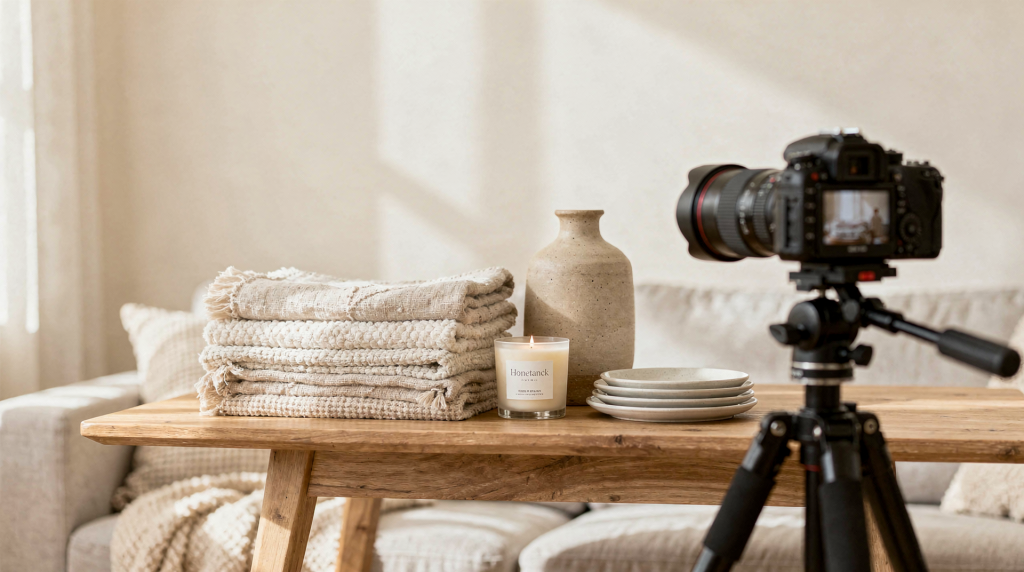
A well-photographed linen throw doesn’t just sit there looking pretty — it tells you how it drapes, how the light hits the weave, and whether it’ll feel right on the arm of your sofa. That’s the kind of information shoppers need in a split second when they land on a product page. Great images for home goods do more than make a store look polished. They answer the unspoken questions every buyer has about scale, material, color, and how something will actually live in their space. The best product photography combines clarity, consistency, and just enough styling intelligence to make an item feel desirable without ever misleading the person on the other side of the screen.
Why home goods photography is different
Home goods are judged differently from almost any other category. A mug, a throw blanket, a candle, a framed print, or a storage basket is rarely bought in isolation. Shoppers instinctively try to place it in a room they know — next to furniture they already own, against a wall color they live with, beside objects that share the same visual language. That mental projection happens fast, and your images either feed it or stop it cold.
I learned this firsthand during years of sourcing and styling textiles and decor. A beautiful wool throw photographed flat on white might look like a generic rectangle, but show it draped over the arm of a reading chair with a book and a cup of tea nearby, and suddenly it has a story. The customer can feel the weight, imagine the texture, and understand the size. That’s the difference between a product shot and a home goods shot that actually sells.
Your images should answer four questions almost instantly:
- What is it?
- What does it look like up close?
- How big is it?
- How would it live in a home?
If a photo set doesn’t answer those, hesitation creeps in. And hesitation — that pause where someone isn’t quite sure — is what kills conversion. People don’t return to a tab when they’re uncertain; they close it.
Start with the right image strategy
The most effective online stores don’t rely on a single type of image. They use a deliberate mix of clean catalog shots and contextual lifestyle photos. A simple first image on a plain background makes the product readable at a glance — essential for category pages, search results, and ads — while supporting images reveal texture, scale, and the way the piece behaves in a real room.
For most home goods, a practical image set looks like this:
| Image type | Purpose | Best use |
|---|---|---|
| Hero shot | Shows the product clearly and consistently | Main product listing image |
| Detail shot | Shows texture, stitching, finish, or material | Textiles, ceramics, wood, metal |
| Scale shot | Shows size in a real setting | Rugs, cushions, vases, art prints |
| Lifestyle shot | Shows the item in a styled room | Helps shoppers imagine ownership |
| Variant shot | Shows color or finish differences | Useful for multiple fabrics, glazes, or frame options |
A clean, neutral first image remains the safest choice for ecommerce. It keeps the product readable, reduces visual noise, and performs consistently across every touchpoint — from a thumbnail in a customer’s wishlist to a hero banner on a mobile screen. You can always bring in warmth and context with the images that follow.
Plan the shoot before you pick up the camera
Most weak product photography happens before the shutter ever clicks. The product is styled too casually, the light is inconsistent, or the shot list is so vague that you end up with twenty near-identical frames and none that actually show what matters. A little planning turns a chaotic session into a repeatable system.
Before you photograph anything, pin down:
- The product’s key selling points — is it the texture, the silhouette, the finish, or the way it catches light?
- The main surface or material detail that needs to be visible — a nubby linen weave, a hand-dipped glaze, a visible wood grain.
- The right mood: minimal, cozy, rustic, modern, or premium — and what that means for your choice of props, surfaces, and light.
- The final image ratio your site uses, so you don’t crop awkwardly later.
- The number of shots needed for each SKU to tell the full story.
For a home goods store, creating a repeatable shot list for every product is one of the smartest time investments you can make. It keeps your catalog visually cohesive and removes the guesswork when you’re photographing a new batch of ceramics or a fresh collection of cushions.
Basic shot list for each product
- Straight-on hero shot
- 45-degree angle
- Close-up detail
- Scale reference shot
- Lifestyle or room-context shot
- Packaging shot if relevant
- Variant shot for colorways or finishes
Use light that shows texture honestly
For home goods, light isn’t just about brightness. It’s about revealing dimension, preserving true color, and making materials feel tactile even though no one can reach out and touch them. A linen throw, a glazed vase, or a woven basket can look flat, synthetic, or lifeless if the lighting is harsh, flat, or uneven.
Natural light is often the easiest and most forgiving starting point. Set up near a large window and, if the sun is too direct, diffuse it with a sheer curtain or a piece of white fabric. Soft, directional light rakes across surfaces and brings out texture without creating hard, distracting shadows. That’s exactly what you want for a hand-thrown mug or a loosely woven cushion cover.
If you’re working with artificial light:
- Keep the key light slightly to one side of the product to create gentle shadows that define shape.
- Add a fill light or a white reflector only if shadows become too heavy and swallow detail.
- Match the white balance to your light source — don’t let the camera guess.
- Avoid mixing window light with lamps in the same frame; the color temperatures will fight each other and make editing a headache.
What good lighting should do
- Show texture clearly — every slub, weave, and brushstroke.
- Preserve true color without shifting warm or cool.
- Avoid blown-out highlights on glossy surfaces like glazed ceramics or glass.
- Minimize ugly shadows that distract from the product.
- Keep the product looking dimensional, not flat as a paper cutout.
A common mistake is over-lighting white or pale products until they lose all shape and become a featureless blob. Another is under-lighting heavily textured items so they look dull and muddy. The goal is never “bright at all costs.” The goal is readable, believable, attractive light that makes someone want to reach into the frame.
Choose backgrounds that fit the product
Background choice quietly signals how premium or practical a product feels. A plain white or light neutral surface keeps attention squarely on the item and creates the consistency that makes a catalog easy to browse. But for home goods, context matters enormously — a cushion photographed floating in white space tells you nothing about how it sits on a real sofa.
Use a clean background when you want:
- Consistency across a large catalog.
- Easy comparison between products.
- Strong performance in search results and category pages.
- Less editing time after the shoot.
Use a styled background when you want:
- More emotional appeal and a sense of story.
- A clear sense of scale.
- Room context that helps the shopper imagine the piece at home.
- An editorial feel that elevates the brand.
Background rules that usually work
- Keep the background uncluttered — it should support, not compete.
- Avoid busy patterns that fight for attention with the product.
- Match the background tone to the product’s mood: warm wood for rustic stoneware, cool linen for modern ceramics.
- Don’t use props that tell the wrong story — a sleek marble slab under a chunky farmhouse vase confuses the eye.
- Keep styling consistent across a product family so the collection feels coherent.
A woven basket photographed on a noisy, crumb-dusted kitchen counter can feel cheap and careless. The same basket on a quiet linen surface or a weathered wooden bench feels intentional, well-made, and worth the price. The background is never neutral — it’s always doing emotional work.
Style the product without overdoing it
Styling should support the product, not bury it. The goal is to make the item feel at home in a real space while keeping it unmistakably the hero of the frame. When I styled home goods for shoots, I learned quickly that the most common mistake was adding one too many things — a stray sprig of eucalyptus, an extra book, a candle that competed for attention. Restraint almost always wins.
Styling principles that work for home goods
- Use fewer props than you think you need. A single well-chosen object often says more than a cluster.
- Repeat a limited palette across the shoot so the eye stays on the product, not on a riot of color.
- Choose accessories that make sense for the product category — a linen napkin near a ceramic plate, matches beside a candle, a throw casually folded next to a cushion.
- Keep edges clean and arrangements balanced. A little negative space lets the product breathe.
- Leave visual breathing room around the item so it doesn’t feel cramped or chaotic.
For example: a candle can be styled with a simple tray, a box of matches, and a single book — that’s enough to suggest an evening ritual. A cushion can sit on a sofa with one or two complementary textiles in related tones, not a full decorative explosion of five patterns. A print should be shown hung or leaned against a wall, not buried among too many competing frame styles. If a prop doesn’t clarify scale, use, or mood, remove it. The product should always be the loudest voice in the image.
Show scale clearly
One of the biggest reasons shoppers return home goods is size mismatch. A vase that looked substantial in the photo arrives and turns out to be palm-sized. A rug that seemed generous barely covers the space beside the bed. Photos that don’t communicate scale create disappointment even when the product itself is lovely.
Ways to show scale effectively:
- Photograph the item in a room setting where furniture gives immediate context.
- Pair it with a known object — a chair, a table, a hand holding a mug — so the brain has a reference point.
- Use consistent dimensions in the product description, but don’t rely on text alone; people look at images first.
- Include a side view for depth, especially for items like vases or baskets that have volume.
- Show framed art or mirrors against a wall with readable proportions, perhaps with a console table or a chair nearby.
If the product is small, avoid cropping too tightly in every image — let it sit in a bit of space so its size is legible. If the product is large, pull back and include a wider room frame so people understand how much visual and physical space it occupies. A floor cushion photographed in a tight corner tells you nothing; the same cushion in front of a sofa with a coffee table nearby tells you everything.
Capture texture and finish properly
Texture is a major selling point for home goods because it’s the quality people most want to touch. Since they can’t, your photos have to do that tactile job visually. A flat, over-lit image of a nubby linen cushion might as well be a digital mockup — it erases the very thing that makes the piece special.
To photograph texture well:
- Use angled light that skims across the surface, creating tiny highlights and shadows that reveal weave, grain, or brushstrokes.
- Include at least one close-up shot per product that lets the shopper almost feel the material.
- Avoid excessive smoothing in editing — don’t turn hand-thrown pottery into something that looks machine-molded.
- Keep fabric folds natural; over-arranged draping can look stiff and artificial.
- Never use filters that alter the material’s appearance, like heavy vignettes that darken edges and hide detail.
This matters especially for:
- Linen, wool, and cotton textiles — where slubs, softness, and weave are everything.
- Hand-thrown ceramics — where slight irregularities are marks of craftsmanship.
- Unfinished wood — where grain and subtle saw marks tell the story.
- Woven natural fibers — baskets, jute rugs, seagrass placemats.
- Matte and gloss finishes — the difference between a chalky matte vase and a high-shine glaze needs to read clearly.
- Printed art and framed pieces — where paper texture and frame profile matter.
If the product has a subtle finish, photograph it from more than one angle. Some materials change dramatically depending on the direction of light — a velvet cushion can look rich and deep from one side and flat from another. Show the most honest, appealing version.
Keep color accurate
Color accuracy is one of the hardest parts of ecommerce photography and also one of the most consequential. A shopper who receives a product that looks different from the image — a “cream” throw that reads beige on screen, a “sage” vase that arrives gray — is unlikely to buy again. Trust breaks fast.
To keep color honest:
- Shoot in consistent, controlled light so you’re not correcting wildly from frame to frame.
- Set white balance deliberately — don’t rely on auto, which can drift scene by scene.
- Avoid heavy saturation edits that make colors pop in a way reality can’t deliver.
- Calibrate your monitor if possible, so what you see while editing matches what others will see.
- Compare edited images side-by-side with the real product under good light before publishing.
Be especially careful with:
- Whites that drift yellow or blue — a warm white linen can look dingy or icy depending on the screen.
- Greens that turn gray — olive and sage tones are notoriously tricky.
- Neutrals that shift too warm — a “greige” can become tan or pink.
- Dark tones that crush into black, losing all detail in shadows.
- Prints and textiles with multiple colors — a pattern with five hues can easily misrepresent one.
If a product varies naturally from piece to piece — as hand-dyed textiles or reactive glazes often do — say so clearly in the description and avoid making the image look artificially uniform. Honesty here builds the kind of trust that brings customers back.
Edit for clarity, not fantasy
Editing should make the product easier to understand, not turn it into something it isn’t. The best retouching removes distractions — dust, a stray thread, an uneven background — and improves consistency across a set while preserving the item’s actual character. When I edited home goods images, I always kept the physical product next to me. If the photo started to look like a different object, I knew I’d gone too far.
Safe editing tasks
- Adjust exposure to reveal detail without blowing out highlights.
- Correct white balance so whites read clean and neutrals stay true.
- Crop for consistency across a product family.
- Remove dust, pet hair, or visible shooting clutter that snuck into the frame.
- Straighten lines — a slightly tilted frame or vase is distracting.
- Match background tone across a set so the catalog feels cohesive.
Editing mistakes to avoid
- Over-blurring texture until linen looks like polyester.
- Making whites too bright — they lose shape and can look blown out on mobile screens.
- Changing color beyond reality — a “terracotta” pot shouldn’t become neon orange.
- Adding fake shadows that look unnatural and break the illusion of a real setting.
- Over-sharpening fabric or wood grain, which creates a crunchy, digital look.
- Replacing context with unrealistic scenes — don’t drop a product onto a digitally rendered room that doesn’t match the actual lighting or scale.
If the item is handcrafted, small imperfections may be part of its appeal — the slight wobble in a hand-thrown rim, the variation in a natural dye. Don’t erase them to the point that the product loses its soul. Authenticity sells.
Optimize images for the store
Beautiful images still need to load fast and work well across every device. Large, unoptimized files slow your site down, frustrate shoppers, and can even hurt search rankings. But you also don’t want to compress so aggressively that the zoom feature becomes useless.
Good image prep usually includes:
- Exporting at a high enough resolution for zoom — shoppers expect to inspect weave or brushstrokes up close.
- Resizing to the maximum display size your site actually needs; uploading a 5000px-wide image when the container is 1200px just wastes bandwidth.
- Using efficient formats for photos — JPEG, WebP, or AVIF depending on your platform and browser support.
- Compressing files without visible quality loss; a slight reduction in file size often has zero perceptible impact.
- Naming files clearly — “linen-throw-oatmeal-hero.jpg” is infinitely better than “IMG_4827.jpg” for both organization and SEO.
A practical standard is to keep images large enough for close inspection while avoiding bloated files. Product photos around 2000px on the longest side are often useful for zoom and high-resolution screens, while keeping file size under control improves load speed. Test how they look on mobile — most home goods shoppers browse on their phones, and a detail that’s crisp on desktop can become muddy on a smaller screen if the file is too compressed or the crop is wrong.
Simple image optimization checklist
- Use clear file names that describe the product and view.
- Crop consistently across a product family so the catalog feels intentional.
- Resize before upload — don’t rely on the platform to do it for you.
- Compress images to balance quality and speed.
- Check how they look on mobile — pinch, zoom, scroll.
- Test zoom quality on detail shots; if it pixelates, the file is too small.
- Add accurate alt text for accessibility and search.
Build a repeatable workflow
A good photography system isn’t about one perfect shoot. It’s about being able to photograph new products quickly and consistently without reinventing the process every time. When I was shooting new arrivals weekly, having a set workflow saved hours and kept the entire catalog looking like it belonged to the same brand.
A simple workflow
- Clean and prep the product — remove tags, dust, and fingerprints.
- Decide the image set before shooting so you don’t forget the scale shot or the detail close-up.
- Set lighting and background; test a frame and check exposure and white balance.
- Shoot the hero image first — it’s the most important and sets the tone.
- Capture angles and close-ups, working through your shot list methodically.
- Style lifestyle scenes with the props you’ve already chosen.
- Review images for color and consistency before breaking down the set.
- Edit and export in the correct sizes, keeping a master file and a web-optimized version.
- Upload and check on mobile and desktop — things can shift in surprising ways.
This process saves time and helps your store look cohesive, especially if you’re photographing multiple home goods categories — textiles one day, ceramics the next, and framed art after that. Consistency builds trust, and trust builds sales.
Common mistakes that make home goods photos weak
- Cropping too tightly and losing context — a cushion needs to be seen on a chair, not as a floating square.
- Using too many props — the product gets lost in a sea of styling.
- Mixing warm and cool light sources — the image feels off, even if viewers can’t articulate why.
- Letting reflections distract from the product — a glossy vase that mirrors the photographer or a window pulls the eye away.
- Shooting from inconsistent angles across products — one cushion shot from above, another from eye level, breaking the catalog’s rhythm.
- Ignoring mobile cropping — the hero shot might look great on desktop but cut off awkwardly on a phone screen.
- Over-editing until the item looks artificial — texture vanishes, colors become hyperreal, and the product feels untrustworthy.
- Forgetting to show scale — the most common reason for returns.
- Making every image lifestyle-only and never showing the product clearly — shoppers still need that clean, isolated view to understand what they’re buying.
The most pervasive failure is trying to make every image “beautiful” instead of useful. A store needs both: the aspirational lifestyle shot that sparks desire, and the straightforward catalog image that answers practical questions. One without the other leaves the shopper guessing.
A practical setup for small brands
You don’t need a full studio to get strong, sellable results. Some of the most charming home goods photography I’ve seen came from a corner of a living room with a big window and a piece of foam board. What matters is control and repeatability — being able to produce the same quality of light and background day after day.
Starter setup
- Large window or a simple softbox lighting kit for consistent, diffused light.
- White foam board or a reflector to bounce light back into shadows.
- Neutral background surface — a roll of seamless paper, a large piece of mat board, or a painted plywood sheet.
- Tripod — eliminates camera shake and lets you keep framing consistent across products.
- Camera or a modern smartphone with manual controls (exposure, white balance).
- Microfiber cloths for dust removal — nothing ruins a close-up faster than a speck on a dark glaze.
- Tape, clamps, and simple stands to hold backgrounds or reflectors in place.
- A few reusable props in one visual style — a linen napkin, a wooden tray, a ceramic cup — that can travel across multiple shoots.
For many small home goods brands, consistency matters more than expensive gear. A simple, disciplined setup used thoughtfully almost always beats a more advanced setup used haphazardly. Master the light you have, keep your backgrounds clean, and build a prop kit that feels like your brand. That’s a foundation you can grow from.
Final checks before publishing
Before uploading images to your store, step back and review them as a shopper would — someone who has never seen the product in person and is trying to decide whether to spend their money.
Pre-publish checklist
- Does the first image clearly show what the product is, without any confusion?
- Can the shopper understand size without guessing — is there a reference point somewhere in the set?
- Does the color match the real product when you hold it next to the screen?
- Are texture and material easy to read, even on a phone?
- Do all images feel like part of the same brand, or does the lighting and styling jump around?
- Are the files optimized for speed without sacrificing the detail needed for zoom?
- Do the photos look good on mobile — is the product still the hero, or does it get lost in a tiny crop?
- Is the product still the focus in every shot, or did the styling take over?
If the answer is yes to most of these, the set is probably strong enough to publish. If you find yourself hesitating on even one point, fix it now — it’s far easier than dealing with returns and disappointed customers later.
Conclusion
Photographing home goods for an online store is really about reducing doubt. Clear images, accurate color, visible texture, and sensible styling help shoppers trust what they’re buying. When your photos answer practical questions — What is it? How big? What does it feel like? — and still feel warm and aspirational, they do more than decorate a product page. They make the sale happen before anyone clicks “add to cart.”
FAQ
What is the best background for home goods product photography?
A clean neutral background is usually best for the main product shot because it keeps attention on the item and works consistently across your store. That said, don’t be afraid to bring in contextual surfaces — raw wood, linen, matte plaster — for supporting images. The key is that the background never fights the product for attention.
Should home goods be photographed on white backgrounds only?
No. White backgrounds are useful for clarity and catalog consistency, but lifestyle and room-context images are essential for showing scale and helping shoppers imagine the product at home. A cushion on white tells you its shape; the same cushion on a sofa tells you how it lives.
How many photos should each product have?
Most home goods products benefit from at least 4–6 images: a hero shot, a detail shot, a scale shot, a lifestyle shot, and any relevant variant images for color or finish. Complex items like furniture or textiles with interesting backs may need a few more.
How do you photograph textured products like linen or woven baskets?
Use soft directional light that skims across the surface to reveal weave and fiber. Avoid harsh glare that flattens texture, and include close-up shots that let the shopper almost feel the material. Keep editing light — don’t smooth away the very thing that makes the piece special.
How do you keep colors accurate in product photos?
Use consistent lighting, set white balance manually, avoid oversaturation in editing, and compare edited images against the real item under good light before publishing. If your monitor isn’t calibrated, at least check the photos on a couple of different screens to catch obvious shifts.
What file size should ecommerce product images be?
Images should be optimized for speed without losing the detail needed for zoom. A good target is large enough for close inspection — often around 2000px on the longest side — but compressed so they load quickly on both desktop and mobile. Test zoom quality on detail shots; if it pixelates, your file is too small or too compressed.