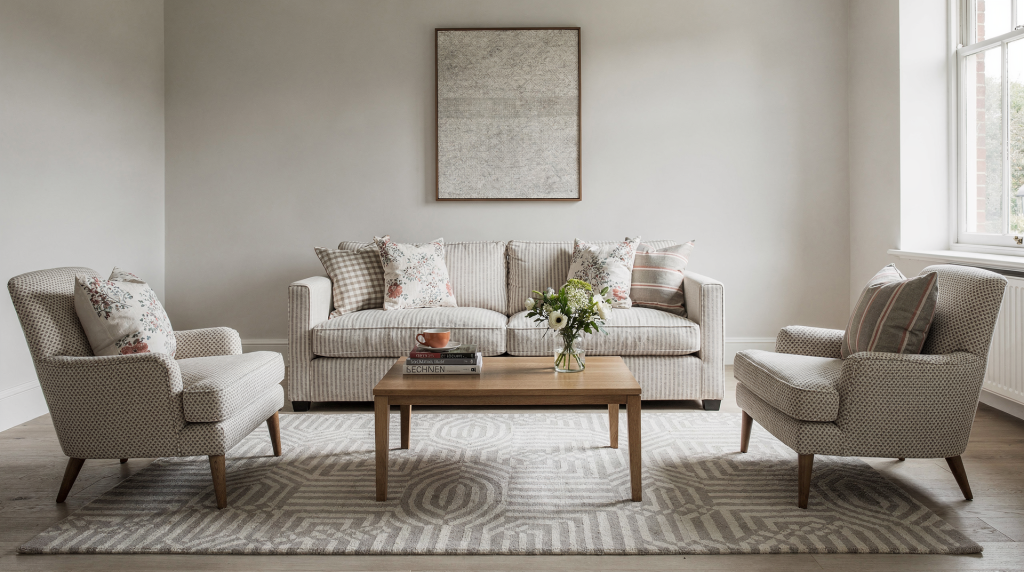
There is a particular moment that happens in almost every home I visit for the first time — the moment when my eye lands on a room that has been layered with pattern, and I can immediately tell whether the mix was intentional or accidental. The intentional ones have a rhythm to them. The accidental ones just feel loud. Pattern mixing is not about how many prints you can fit into one space. It is about creating enough contrast and repetition that the room reads as composed rather than chaotic. Get it right, and even a modest rental apartment can feel collected and deeply personal. Get it wrong, and the space never quite settles.
Why pattern mixing works
Patterns do something that solid colour alone cannot: they give a room a sense of movement. A flat expanse of beige wall or a plain grey sofa sits still. Introduce a printed cushion or a striped rug, and suddenly the eye has somewhere to travel. That visual journey is what makes a room feel finished — not overdecorated, but complete.
Beyond movement, pattern bridges other elements in a space. It can connect a vintage armchair to a modern coffee table, or soften the hard edges of a minimalist kitchen. In rentals, where the bones of the room are often generic — think beige carpet, white walls, builder-grade everything — pattern becomes the fastest way to inject character without touching a paintbrush. A well-chosen print on a duvet cover or a pair of curtains can shift the entire personality of a room overnight.
The most common misstep I see is treating pattern as an afterthought — something you toss in with a few cushions once the furniture is already arranged. In the rooms that truly work, pattern is part of the conversation from the very beginning. It is considered alongside the sofa, the rug, the wall colour. That does not mean you need to plan every detail before you start; it just means giving pattern a seat at the table, not leaving it to hover awkwardly by the door.
Start with a clear base
Before you even open a fabric swatch book or scroll through cushion listings, ask yourself what you want the room to feel like. Not what you want it to look like — what you want it to feel like when you walk in at the end of the day. Calm and cocooning? Playful and energetic? Tailored and crisp? That emotional brief should guide every pattern decision that follows.
A neutral base is the most reliable starting point, and I want to be clear about what that means. Neutral does not mean boring. It does not mean everything must be oatmeal and off-white. A neutral base can be white walls paired with oak flooring, a flax linen sofa, or a jute rug with barely-there texture. What matters is that the foundation does not compete for attention. It holds the room steady so that when you introduce a bold floral or a graphic stripe, those pieces have space to do their job.
If the room already carries a lot of architectural weight — ornate ceiling mouldings, statement herringbone floors, a wall of windows with a busy urban view — then your pattern load should be lighter. Let the architecture lead, and use pattern sparingly as a supporting player. In a plainer box of a room, pattern can step forward and carry more of the visual responsibility.
Good base elements
- Solid-coloured sofa or bed frame — upholstery that reads as one quiet tone
- Plain walls or paint with a subtle limewash or chalky texture rather than a flat matte finish
- Natural wood finishes — oak, ash, walnut — that bring warmth without adding another layer of visual information
- One large neutral rug — sisal, jute, or a low-pile wool in an undyed tone
- Curtains in linen, cotton, or lightweight wool with minimal or no print — think texture over pattern
The simplest formula: large, medium, small
If you take only one idea from this article, let it be this: vary the scale. Scale is what separates a room that feels rhythmical from one that feels like a wall of noise. When every pattern in a room sits at roughly the same size, the eye cannot find a place to land. Everything competes at equal volume.
Think of pattern scale as visual distance. A large-scale print — a sweeping floral, a wide stripe, an oversized geometric — reads clearly from across the room. It announces itself. A medium-scale pattern sits in the middle distance, bridging the gap between the bold statement and the quieter details. A small-scale pattern works almost like texture; you notice it up close, but from a few steps back it recedes into a gentle hum.
This hierarchy is not about strict rules. It is about giving the eye a path to follow. Start big, move to medium, finish with small. The room will feel layered rather than cluttered.
A practical scale rule
- 1 large-scale pattern — the room’s visual anchor
- 1 to 2 medium-scale patterns — the supporting cast
- 1 small-scale or subtle pattern — the detail that rewards a closer look
- Solid colours throughout — the breathing room that holds it all together
A floral rug with blooms the size of your hand, striped curtains with bands a few inches wide, and a small-check linen cushion can coexist beautifully — provided the rest of the room stays relatively quiet. The solids do the heavy lifting of keeping the space calm.
Build around one anchor pattern
Every well-patterned room has a lead performer. One print that sets the tone, carries the most visual weight, and gives the rest of the mix something to respond to. This anchor could be the rug, the duvet cover, the upholstery on an armchair, or a dramatic pair of curtains. It should be the most confident pattern in the space — the one you would keep even if you stripped everything else back to neutrals.
Once you have chosen your anchor, pull at least one or two of its colours out into the rest of the room. That repetition is what makes the mix feel deliberate. Without it, even beautiful patterns can feel like they wandered in from different houses. The colour connection does not need to be exact — a rust tone in the rug can echo a terracotta cushion, a faded indigo in the curtains can reappear in a throw — but it does need to be legible.
Good anchor pieces
- Rug — often the largest patterned surface in the room
- Headboard fabric — sets the mood for the entire bedroom
- Sofa upholstery — a bigger commitment, but a powerful one
- Bedspread or duvet cover — especially effective in a bedroom with otherwise neutral bones
- Large curtain panels — they frame the room and draw the eye upward
If you are unsure where to begin, start with the largest patterned piece you already own or plan to buy. It is far easier to layer smaller patterns around a strong foundation than to try to force cohesion onto a room full of prints that were chosen in isolation.
Keep the color palette tight
A disciplined colour palette is the invisible thread that holds a patterned room together. You do not need every print to share identical shades — that can look stiff and over-coordinated — but the room as a whole should feel like it belongs to the same family of tones.
I typically work within a range of three to five core colours, including neutrals. That is enough to create depth and variation without tipping into chaos. The neutrals — white, cream, warm grey, natural linen, soft black — act as the glue. The accent colours bring the personality.
The more saturated your palette, the more restraint you need in other areas. A room built around jewel tones — emerald, sapphire, ruby — can be stunning, but it will feel overwhelming if every surface carries the same intensity. In those cases, pull back on pattern quantity and let the colour itself do the work.
Example palette structures
- Soft blue, ivory, warm grey, rust — calm and collected, with rust adding just enough heat
- Olive, cream, black, natural flax — earthy and grounded, black providing definition
- Navy, white, camel, muted red — classic and tailored, the red used sparingly as punctuation
- Sage, oatmeal, charcoal, brass — soft and sophisticated, brass bringing a metallic note through hardware or lighting
Mix different types of pattern
The strongest pattern mixes happen when the prints have different visual jobs. A room full of florals, no matter how varied the scale, can start to feel one-dimensional. The same goes for a room of nothing but geometrics. What you want is contrast in motif — structured against fluid, orderly against organic.
This is not about matching. It is about creating a conversation between prints that have different energies. A crisp stripe brings order. A painterly floral brings softness. A check feels grounded. An abstract print adds unpredictability. When you pair them thoughtfully, each pattern makes the other look more interesting.
Reliable pairings
- Stripe + floral — the most enduring combination in interior design, and for good reason
- Check + organic motif — gingham or windowpane check against a loose botanical or leafy print
- Geometric + painterly print — sharp angles softened by brushy, imperfect marks
- Plaid + small-scale dot or micro-pattern — traditional meets delicate
- Abstract print + classic stripe — contemporary energy anchored by something timeless
The reason these pairings work is that they balance each other. Structured patterns provide a framework; fluid patterns provide movement. If everything in the room is rigid, the space feels stiff. If everything is soft, it can feel ungrounded. The mix is what gives the room dimension.
Use solids as punctuation, not an afterthought
A room saturated with pattern needs places for the eye to pause. Solids are those pauses. They are not the boring bits you tolerate between prints — they are an active design tool that lets the patterns breathe.
This does not mean stripping pattern out of the room. It means being deliberate about where you place solid surfaces so that the overall composition has rhythm. Think of it like music: the rests are as important as the notes.
Easy ways to add breathing room
- Solid wall paint — even one wall in a quiet tone can reset the visual balance
- Plain lampshades — they sit at eye level and can calm a busy corner instantly
- Unpatterned throw blanket — draped over a patterned sofa, it creates a restful zone
- Solid cushions mixed into a patterned group — a block of linen or velvet among the prints
- Wood, stone, or metal surfaces — natural materials that add texture without adding pattern
A useful rule of thumb I return to often: if the room starts to feel restless, reduce pattern density before you reduce colour. Often the issue is not that there is too much going on, but that there is nowhere for the eye to land.
Watch pattern density, not just pattern count
Here is something that surprises people: two patterns can feel busier than four. It all comes down to density. A dense pattern — think a tightly packed toile, a detailed paisley, a small-scale repeat with very little negative space — carries a lot of visual information per square inch. An open pattern — a wide stripe, an airy check, a print with generous background space — reads as calmer, even if the colours are strong.
When you are combining patterns, pay attention to how much visual breathing room each one has. A room can comfortably hold several patterns if most of them are open and only one or two are dense. The moment you pair two high-density prints, the room can tip into overwhelm — unless you deliberately keep one of them very low contrast or very small in scale.
Balance dense with open
- Dense toile + open stripe — the stripe gives the eye a break from the intricacy
- Packed floral + airy check — the check reads almost like a solid from a distance
- Detailed paisley + wide banded stripe — scale and density both working in contrast
- Small repeated motif + larger abstract print — the abstract print feels expansive next to the tight repeat
Match mood, not just motif
Patterns do not need to “match” in the traditional sense. They do not need to come from the same collection or share an obvious theme. What they do need is to share a mood. A room can happily mix a classic ticking stripe with an abstract botanical if both feel soft, muted, and relaxed. The same stripe paired with a high-contrast, glossy geometric will feel jarring — not because the motifs clash, but because the energies do.
Before you commit to a combination, step back and ask yourself a few questions. Is this room meant to feel formal or relaxed? Should the patterns read crisp and tailored, or soft and lived-in? Is the overall mood vintage, coastal, tailored, eclectic, rustic? When the mood is consistent, the room holds together even when the individual prints are quite different from one another.
Where to be bold — and where to hold back
Not every surface in a room needs to carry pattern. In fact, the rooms I find most successful are the ones where pattern is concentrated in a few strategic zones and the rest of the space stays quiet. Textiles are the easiest place to introduce print because they are flexible — you can swap out cushions, throws, and curtains with the seasons or as your taste evolves.
Best places for pattern
- Pillows — low commitment, high impact
- Rug — anchors the room and sets the colour direction
- Armchair — a single patterned chair in an otherwise neutral room is a classic move
- Curtains — they frame the entire space and draw the eye up
- Bedding — the bed is usually the largest surface in the room, so it carries pattern well
- Ottoman or bench upholstery — a smaller upholstered piece that adds pattern without dominating
Places to keep calmer
- Large sofas — a patterned sofa is a big commitment and can limit your future choices
- Big storage pieces — wardrobes, bookcases, sideboards — let them recede rather than shout
- Walls in small rooms — one patterned wall can work, but all four can close the space in
- Major flooring choices — hardwood, stone, or tile in a permanent finish is harder to change than a rug
- Oversized artwork near other strong prints — let the art or the pattern lead, not both
In a compact room, one strong pattern zone is often enough — a rug, or a bedspread, or a pair of curtains. In a larger, open-plan space, you can distribute pattern more widely, but each area should still have its own visual rest point so the room does not feel relentless.
Step-by-step: how to mix patterns in one room
When I am working with a room from scratch, I follow a sequence that keeps the process manageable. It prevents the overwhelm that comes from trying to choose everything at once.
- Pick the anchor. Choose the strongest pattern or the largest patterned item in the room. This is your foundation.
- Pull colours from it. Select two or three colours from that anchor and repeat them elsewhere — in cushions, a throw, a piece of art, a lampshade.
- Add a contrasting scale. Pair the anchor with a pattern that is noticeably larger or smaller so the room has rhythm.
- Include a different pattern family. If the anchor is floral, add a stripe or check. If it is geometric, add something softer and more organic.
- Insert solids. Use plain pieces — a solid cushion, a neutral throw, a quiet wall — to slow the eye down.
- Step back and edit. Look at the room from the doorway. If two patterns are competing at the same scale or contrast level, remove one or reduce its presence.
Pattern mixing by room type
Different rooms have different tolerances for pattern. A living room can handle more layers because it typically contains multiple textile surfaces — sofas, armchairs, curtains, rugs, cushions. A bedroom needs more softness and less visual activity. A dining room, with its more structured furniture, can take a crisper, more defined approach. And a rental, with its limitations on permanent changes, benefits from pattern in a very specific way.
Living room
Living rooms are the most forgiving spaces for pattern mixing because they naturally accommodate multiple layers. The key is to distribute pattern across different surfaces rather than piling it all onto the sofa.
Best approach
- Use a patterned rug as the base — it anchors the seating area and sets the colour story
- Add one patterned chair or introduce pattern through sofa cushions rather than upholstering the entire sofa
- Repeat one colour from the rug in the curtains or a piece of art to create a visual link
- Leave the remaining surfaces — walls, larger furniture — relatively calm
A combination I return to often: a large-scale rug pattern, striped linen cushions, and a solid-coloured sofa in a tone pulled from the rug. It reads as layered and intentional without feeling busy.
Bedroom
Bedrooms need a lighter hand. This is a room designed for rest, and too much visual noise can work against that. Pattern should feel soft and settled, not demanding attention.
Best approach
- Choose patterned bedding or a patterned headboard — not both at full strength. If the headboard is upholstered in a print, keep the bedding relatively quiet, and vice versa.
- Add one or two cushions with patterns at a different scale from the main print
- Keep curtains understated if the bed carries the pattern — solid linen or a very subtle stripe is often enough
In most bedrooms, one primary print and one secondary accent pattern is the sweet spot. More than that, and the room can start to feel restless — the opposite of what you want at the end of the day.
Dining room
Dining rooms lend themselves well to structured pattern because the furniture tends to be more defined — a table, a set of chairs, perhaps a sideboard. There is less soft upholstery to absorb pattern, so the prints you do introduce read clearly.
Best approach
- Upholster dining chairs in a repeating print — this creates rhythm around the table
- Keep table linens simple — a patterned tablecloth on patterned chairs can feel overworked
- Introduce a patterned roman shade or drapery if the chairs are solid
- Anchor the mix with a solid table and quiet walls so the patterns have space to stand out
Rental spaces
Rentals are where pattern becomes a genuine problem-solver. When you cannot change the wall colour, the flooring, or the kitchen cabinets, textiles and removable pieces become your primary tools for creating character. Pattern does the heavy lifting that paint and permanent finishes cannot.
Best approach
- Lay a patterned rug over basic carpet or uninspiring flooring — it instantly shifts the room’s centre of gravity
- Hang curtains with subtle texture or a quiet print — even a tonal stripe adds depth without overwhelming
- Use cushions and throws to introduce colour and pattern that can move with you when the lease ends
- Add removable art — prints, textiles hung as wall pieces, or even a patterned tapestry — that repeats the room’s palette
If the room has standard builder-grade finishes — beige walls, beige carpet, no architectural detail — pattern is your best friend. But keep the palette disciplined. In a space with little inherent character, too many competing colours can feel chaotic rather than curated.
Common mistakes to avoid
- Choosing patterns that all sit at the same scale — the room ends up feeling repetitive and flat
- Mixing too many strong colours without a neutral anchor to ground them
- Ignoring solid surfaces entirely — without visual pauses, the eye has nowhere to rest
- Pairing several busy patterns with no clear dominant one — the room lacks hierarchy
- Using novelty prints that do not share the room’s overall mood — a whimsical print in an otherwise serene space can feel jarring
- Forgetting to test fabrics together in natural light — colours and contrasts shift dramatically from the shop floor to your living room
Quick checklist before you commit
Before you buy another cushion or order that curtain fabric, run through these questions. They will save you from the most common pitfalls.
- Does one pattern clearly lead the room, or is everything competing for attention?
- Do the patterns share at least one or two colours — not necessarily identical, but visibly related?
- Is there a mix of large, medium, and small scale across the room?
- Is there enough solid space — walls, furniture, flooring — to rest the eye?
- Does the room feel balanced when you look at it from across the room, not just from up close?
- Would removing one item actually improve the composition?
If the answer to any of these is no, edit before you add. Often the best thing you can do for a room is take something away.
A simple formula you can trust
If you want a starting point that works in almost any room, here is the structure I reach for when I am styling a space from scratch or helping a friend who feels stuck:
- One bold anchor pattern — the rug, the bedspread, the statement chair
- One striped or check pattern — structured, reliable, and endlessly versatile
- One small-scale supporting pattern — a dot, a micro-floral, a subtle geometric
- One or two solid elements — cushions, a throw, a lampshade, a wall
- A shared colour palette running through every piece
That formula gives you contrast without disorder, personality without noise. It works in a studio apartment and it works in a family living room. The specifics change, but the structure holds.
Conclusion
Mixing patterns is less about following rules and more about developing an eye for editing. The rooms that feel most successful are not the ones with the most prints — they are the ones where the prints relate to each other, where the scale shifts from one piece to the next, and where the eye always has a place to pause. Start with one anchor you love. Keep the colours under control. Vary the pattern size. Use solids as balance, not as an afterthought. When it is done well, pattern does not overwhelm a space. It gives the room depth, personality, and the unmistakable sense that someone actually lives there — and that, ultimately, is the whole point.
FAQ
How many patterns are too many in one room?
There is no magic number, but in my experience most rooms settle comfortably with two to four patterns plus a healthy dose of solids. The more dramatic or dense the prints, the fewer you need. A room with one large-scale floral, one stripe, and one small check can feel richer than a room with six competing prints.
Can you mix stripes with florals?
Absolutely. It is one of the most reliable combinations in interior design. The stripe brings structure; the floral brings softness. The key is to vary the scale — a wide stripe against a medium-scale floral, or a fine pinstripe against a larger bloom — and to keep the colours connected so the two prints feel like they belong in the same room.
What if my room already feels busy?
Reduce the number of patterns before you reduce the colour. Often the issue is not too much hue but too many competing prints at similar scales. Add more solids to create breathing room, simplify the scale range, and make sure one pattern is clearly leading. Sometimes removing a single cushion or swapping a busy throw for a solid one is all it takes.
Do all patterns need to match exactly?
No, and in fact they should not. Exact matching — where every print shares identical colours and a similar motif — can make a room feel rigid and over-coordinated, like a furniture showroom. Patterns only need to feel related through colour, scale, or mood. A little tension between them is what makes the room feel collected rather than decorated in one afternoon.
Is pattern mixing okay in small rooms?
Yes, but restraint matters more when square footage is limited. In a small room, use one strong pattern — a rug, a bedspread, a pair of curtains — and a few quieter supporting prints rather than covering every surface. The goal is to add personality without making the space feel smaller or more cluttered than it is.