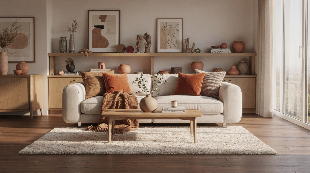
The biggest interior design shift for 2026 is simple: homes are becoming warmer, more layered, and much more personal. After years of hard-edged minimalism and overly curated rooms, people are choosing spaces that feel lived in, tactile, and collected over time.
That does not mean chaos or clutter. It means better materials, more depth, and rooms that reflect how you actually live.
What Defines 2026 Interior Design?
2026 design is less about one “look” and more about a clear direction. Across major trend forecasts, the same themes keep appearing: warm woods, richer color, tactile finishes, vintage character, and a move away from sterile, showroom-style interiors.
What is interesting is how these elements work together in a real room. A walnut sideboard does not exist in isolation — it anchors a corner, catches lamplight differently than pale oak, and changes how the surrounding textiles read. That is the kind of thinking driving this shift. It is not about swapping one aesthetic for another; it is about building rooms that feel substantial and responsive to daily life.
In practical terms, this means:
- more texture instead of flat, polished surfaces
- warmer neutrals instead of cool gray
- layered lighting instead of one overhead fixture
- objects with history, not just matching sets
- rooms that support daily life, not just photos
The result is a home that feels settled, not staged. When you walk into a room like this, you sense that it evolved rather than arrived fully formed from a single shopping trip. That quality is hard to manufacture, but entirely possible to cultivate with the right choices.
The Core Trends Shaping Homes in 2026
1. Warm woods are back
Light oak is giving way to medium and dark woods such as walnut, cherry, elm, and richer oak finishes. These tones instantly make a room feel more grounded and expensive-looking without being flashy.
There is a practical reason this works so well right now. After a decade of pale Scandi-inspired interiors, many rooms began to feel weightless — pretty in photographs but slightly unmoored in person. A walnut dining table or a cherry-framed armchair introduces visual gravity. It anchors the eye and gives softer elements like linen curtains or a wool rug something to play against.
Use warm wood for:
- dining tables
- sideboards
- shelving
- chair frames
- picture ledges
A useful rule: if your room feels cold, introduce wood before adding more color. Wood shifts the temperature of a space without committing to a paint decision, which makes it especially useful in rentals where wall changes are limited.
2. Texture matters more than perfection
Designers are leaning into materials you can feel: bouclé alternatives, mohair, alpaca, linen, embroidered fabric, textured plaster, patinated metal, limewash, and rough stone.
The point is not to make every surface busy. It is to create contrast. A room with smooth walls, soft upholstery, and a natural-fiber rug feels richer than a room full of glossy matching finishes. The hand moves across these surfaces differently, and that tactile variety registers even when you are not consciously touching anything.
One nuance worth noting: texture reads differently depending on light. A heavily textured throw on a sofa near a north-facing window can look flat and heavy during the day but come alive under a table lamp in the evening. When layering textures, think about how they perform across the full arc of daylight and artificial light — not just how they photograph at noon.
3. Color is getting deeper and earthier
In 2026, color trends are moving toward terracotta, olive, sage, dusty blue, burgundy, maroon, brown, taupe, and buttery yellow. Even when the palette stays neutral, the undertones are warmer.
This works especially well in English homes, where overcast light can flatten cooler shades. Warmer pigments help rooms feel brighter, even when they are not painted white. I have seen a north-facing bedroom painted in a soft mushroom tone feel more luminous than the same room in a cool gray — the warmth in the pigment catches whatever light is available and reflects it back as glow rather than shadow.
If you are testing these colors, start with textiles before committing to walls. A terracotta cushion or an olive throw lets you live with a hue for a few weeks. You will notice quickly whether it lifts the room or sits awkwardly against the existing light.
4. Pattern is returning, but in smarter ways
Pattern is showing up again in rugs, drapery, upholstery, throws, wallpaper, and mixed textile combinations. The difference in 2026 is that pattern is more layered and less matchy-matchy.
Expect to see:
- plaid with stripes
- floral with plain weave
- checked textiles with vintage art
- wallpaper used like artwork
- salon-style art walls
The goal is not visual noise. It is a room that feels assembled over time. A striped linen cushion next to a floral armchair does not look like a mistake when the colors share an undertone. The key is finding a common thread — a shared hue, a similar saturation level, or a complementary scale — that lets the patterns converse rather than compete.
5. Homes feel more personal and less generic
This is the biggest directional change. People are moving away from catalog-perfect rooms and toward spaces that show taste, memory, and individuality.
That includes:
- inherited pieces
- secondhand finds
- local art
- handmade ceramics
- books on display
- imperfect vintage furniture
- objects collected on travel or over time
A room becomes more interesting when it tells you something about the person living there. This is not about sentimentality for its own sake. It is about the texture of a life lived in a space. A chipped ceramic bowl from a market in Lisbon, a framed sketch bought from a street artist, a stack of well-thumbed paperbacks on a side table — these are the details that make a room feel inhabited rather than installed.
Trend Snapshot: What to Use in 2026
| Trend | What it looks like | Best use case | What to avoid |
|---|---|---|---|
| Warm woods | Walnut, cherry, medium oak | Living rooms, dining areas, bedrooms | Overusing one wood tone everywhere |
| Layered textures | Linen, mohair, stone, plaster | Softer, more inviting rooms | Mixing too many textures without a plan |
| Earthy color palettes | Olive, terracotta, burgundy, taupe | Walls, textiles, accent furniture | Neon-bright accents that fight the palette |
| Personal styling | Books, art, vintage objects | Shelving, mantels, consoles | Overcrowding every surface |
| Pattern mixing | Checks, stripes, floral, geometrics | Rugs, curtains, cushions | Using only one scale of pattern |
| Moody rooms | Deep green, inky blue, espresso | Bedrooms, studies, snug spaces | Making every room dark and heavy |
How to Use 2026 Trends Without Repainting Your Whole House
You do not need a full renovation to make your home feel current. In fact, the most effective updates are usually the simplest. I have walked into rooms where the only changes were a new rug, a different lampshade, and a rearranged console table — and the space felt entirely transformed. The bones were the same, but the atmosphere had shifted.
Start with soft furnishings
The easiest place to bring in 2026 style is textiles. They are portable, relatively affordable, and forgiving if you change your mind. A linen throw folded over the arm of a sofa introduces texture instantly. A pair of cushions in muted olive or rust can pull a whole seating area into the current palette without touching a paintbrush.
Try:
- linen or wool throws
- cushions in earthy solids or subtle pattern
- heavier curtains in warm tones
- a rug with visible weave or vintage character
- bedding in cream, rust, olive, or muted stripe
Textiles are the lowest-risk way to test a new palette. Live with them for a season. If the rust throw feels too heavy in summer, swap it for a lighter linen in a warm sand tone. The room breathes with the seasons, which is exactly what a layered home should do.
Replace the “empty” look with layered surfaces
Flat surfaces can make a room feel unfinished, even when everything is expensive. Add depth by grouping objects. The trick is to think in vignettes — small, intentional arrangements that give the eye a place to land.
A good console table arrangement might include:
- one lamp
- one framed artwork
- one small stack of books
- one ceramic object
- one plant or vase
This is more effective than scattering five unrelated items around the room. The lamp casts a pool of light that draws you toward the grouping; the books add horizontal lines; the ceramic piece introduces a handmade texture. Together, they create a moment that feels composed rather than accidental.
Mix old and new
A room styled only with new furniture can feel generic. A room styled only with antiques can feel heavy. The strongest interiors in 2026 blend both. There is a tension between a sleek modern sofa and a weathered wooden stool that makes both pieces more interesting than they would be alone.
A simple formula:
- one contemporary anchor piece
- one vintage item
- one handcrafted object
- one natural texture
- one personal element
That balance keeps the room from feeling overly designed. It also makes the space more forgiving — when everything is not brand-new, a scuff on the floor or a faded cushion cover reads as character rather than damage.
Work with the light you have
English homes often deal with changing light, small rooms, and less-than-perfect proportions. That is why the current trend toward warmth and depth works so well here. Instead of fighting the architecture, you work with it.
Use lighter colors in north-facing rooms, but choose warmer undertones. A warm cream or soft mushroom will reflect light more kindly than a stark white, which can turn blue-gray in shadow. Use darker colors in rooms where you want intimacy — a snug, a study, a bedroom that faces east and floods with morning light. Use mirrors carefully; one good reflective surface is better than several small ones. A single large mirror opposite a window can double the light in a room; a cluster of small mirrors just fragments it. Use lamps instead of relying only on overhead lighting. A room lit entirely from the ceiling feels flat. A room with pools of light at different heights feels inhabited.
Room-by-Room Ideas for 2026
Living room
This is where layering has the biggest impact. The living room is the space guests see first and the place you unwind at the end of the day, so it needs to work on both fronts — welcoming and restful.
Focus on:
- a sofa in a warm neutral
- two or three cushions with different textures
- a wool or jute rug
- a wood coffee table
- table lamps instead of harsh ceiling light
- framed art that feels personal, not generic
If the room feels flat, introduce one darker element such as a coffee table, lamp base, or curtain fabric. That single anchor point creates depth and gives the lighter elements something to relate to.
Bedroom
Bedrooms in 2026 are moving toward calm, cocoon-like comfort. This is not about making the room dark — it is about making it feel enveloping. The difference is in the textures you choose and how they absorb sound and light.
Best updates:
- heavier bedding with texture
- painted walls in soft mushroom, olive, or deep muted tones
- a pair of mismatched bedside lamps
- vintage bedside tables
- curtains that pool slightly for softness
Keep the palette restrained and let texture do the work. A linen duvet cover in a warm cream, a wool throw at the foot of the bed, and curtains in a heavyweight cotton blend create a room that feels serene without being boring.
Kitchen
Kitchens are becoming less sterile and more lived in. The all-white, handleless kitchen is giving way to spaces that feel like they belong in a home rather than a showroom.
Look for:
- warm wood cabinetry or shelving
- mixed metals rather than one uniform finish
- stone with visible movement
- open shelves used selectively
- upholstered or counter stools with softer lines
If a full kitchen update is not possible, change hardware, lighting, and seating first. Swapping chrome handles for unlacquered brass, adding a pendant light with a warm glow, and bringing in two upholstered counter stools can shift the entire feel of the room in a weekend.
Bathroom
Bathrooms are shifting toward spa-like but personal spaces. The goal is a room that feels restorative rather than clinical.
Useful updates:
- warmer tile tones
- textured towels
- wood accents
- softer lighting
- one piece of art that can handle humidity
- a vanity styled with fewer, better objects
Avoid turning the bathroom into a display shelf. Calm is still the goal. A single ceramic vase with a stem or two, a neatly folded stack of textured towels, and a wooden stool for a bath brush are enough. The room should breathe.
Home office
The 2026 home office is more specific and less makeshift. After years of temporary desk setups, people are investing in workspaces that feel permanent and pleasant to inhabit for hours at a time.
That means:
- better task lighting
- a desk that does not look temporary
- one or two framed pieces of art
- closed storage for visual calm
- a comfortable chair, not just a stylish one
- a small decorative object to soften the work zone
A good office should feel productive without looking corporate. A wooden desk with a warm finish, a linen-covered pinboard, and a ceramic cup for pens can make the difference between a room you dread entering and one you settle into with ease.
Common Mistakes to Avoid
Chasing every trend at once
If you use warm wood, bold pattern, moody paint, vintage furniture, and layered textiles all in one room without editing, the result can feel confused. The room loses its focal point and becomes a catalogue of good intentions rather than a coherent space.
Pick a lead idea and support it with two or three secondary choices. If warm wood is your anchor, let the textiles and wall color play a supporting role. The room will feel intentional rather than overstuffed.
Confusing “personal” with cluttered
Personal interiors are not the same as overcrowded interiors. Keep only what adds beauty, memory, function, or rhythm to the room. A shelf crammed with every souvenir from every trip does not feel personal — it feels chaotic. A shelf with three well-chosen objects and space around them tells a clearer story.
A helpful question: does this object improve the space, or just occupy it? If you cannot answer that question, the object may be filler rather than a meaningful addition.
Using one texture repeatedly
If everything is bouclé, everything is matte, or everything is smooth, the room will still fall flat. Good interiors need contrast. The eye needs variation to stay engaged; the hand needs different surfaces to register depth.
Try pairing:
- hard with soft
- old with new
- woven with polished
- structured with relaxed
A smooth leather armchair next to a nubby wool throw, a glossy ceramic lamp on a rough-hewn wooden side table — these juxtapositions create energy without adding more objects.
Ignoring proportions
A layered room still needs balance. Oversized sofas, tiny rugs, and underscaled art are common reasons a room feels wrong even when the style is right. A rug that stops short of the furniture legs makes the seating area feel unmoored. Art that is too small for the wall above a sofa looks apologetic.
Measure before you buy. A rug should extend at least under the front legs of the furniture in a seating group. Art above a sofa should be roughly two-thirds the width of the piece below it. These are not arbitrary rules — they are guidelines that help a room feel anchored.
A Simple Styling Method for 2026
Use this five-step approach when updating a room:
- Choose one warm anchor color.
- Add one natural material, such as wood, wool, linen, or stone.
- Introduce one piece with history, such as vintage art or furniture.
- Layer in texture through cushions, curtains, or a rug.
- Finish with personal objects that mean something to you.
If the room still feels unfinished, do not add more decor immediately. Check the lighting and scale first. Often, a room that feels incomplete is simply under-lit or has furniture that is slightly out of proportion. Adjust those elements before bringing in more objects.
Checklist: Is Your Room 2026-Ready?
- The room has at least one warm material, such as wood or linen.
- There is visible texture on more than one surface.
- The palette feels soft, earthy, or grounded.
- At least one item has personality or history.
- Lighting comes from more than one source.
- The room looks intentional, but not overworked.
- Nothing feels like it was bought just to fill space.
When to Follow a Trend and When to Ignore It
Follow a trend when it solves a real problem:
- a cold room needs warmth
- a flat room needs texture
- a generic room needs personality
- a hard room needs softness
Ignore a trend when it fights the architecture or your routine. If a style looks good online but does not work with your light, your layout, or your habits, it is not a useful trend for your home. A moody, dark-walled study sounds romantic, but if you need that room for detailed paperwork in the afternoon, you may regret the paint choice by day three.
That is why 2026 design is less about copying a look and more about editing your space with more confidence. The trends are tools, not instructions. Use the ones that serve your life and leave the rest.
Final Thoughts
The 2026 interior design direction is not about making homes louder. It is about making them feel more considered, more human, and more lived in. Warm woods, layered textiles, earthy color, and personal objects all point to the same idea: a good home should feel collected, not assembled overnight.
If you are updating a space this year, start with texture, then add warmth, then bring in pieces that reflect who you are. That approach will outlast any single trend cycle. Trends come and go, but a room that feels like you — that is a room you will want to come home to for years.
FAQ
What is the biggest interior design trend for 2026?
The biggest trend is the move toward warmer, more layered, and more personal interiors.
Are neutral interiors still in style in 2026?
Yes, but cooler neutrals are fading. Warm whites, taupes, mushroom tones, and earthy beiges are more current.
How can I make my home feel trendy without looking dated next year?
Focus on timeless upgrades: warm materials, good lighting, quality textiles, and personal objects. Avoid overcommitting to one strong trend.
What colors are best for 2026 interiors?
Olive, terracotta, burgundy, brown, taupe, sage, dusty blue, and warm cream are especially relevant.
Is minimalism over?
Not entirely. But the strict, stripped-back version is losing ground to softer, more layered interiors with more personality.
How do I make a small English home feel stylish in 2026?
Use warm color, layered lighting, tailored storage, textured textiles, and a few meaningful objects. In smaller homes, editing matters more than adding.